Lizard Queen
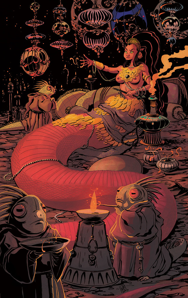
I've been drawing this snake lady for over a week now, and I really wanted to do a piece with her, so I sat down and thumb-nailed a few compositions out and finally came up with this...
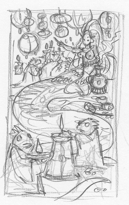
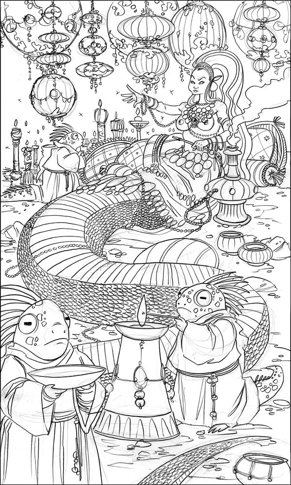
I did the refined sketch by blowing up my thumbnail to approx. 11" x 17" and tracing it out on marker composite paper.
The ink took me the longest to do. Because of the fine detail in her body and the upper bg, I actually was using a 0 pt WN Series 7 brush for a fair chunk of this. Normally I don't go that small, but I wanted her to seem delicate, and I was worried that a No.2 or my larger chinese painting brushes could get too loose or horsey looking.
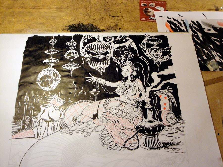

This is the final ink, color corrected and set into it's template in photoshop...

(Read this post to see why I am inking this in 2 colors.)
Coloring my pieces, even my graphic coloring, has become a more arduous process because I am trying to incorporate some of the techniques I am using in my Kung Fu Panda work, while keeping the look of my brush. It's been a tricky balance to find, but I finally have a rhythm down, which is most of the battle.
Anyway, here be the flats...

The overlay and gradient layers help to key the local color...and glowy things are pretty :3
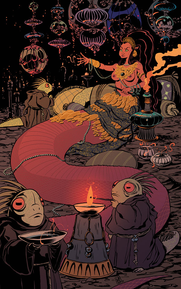
And the final piece, with some detailed cell shading, halftones and textures laid in...
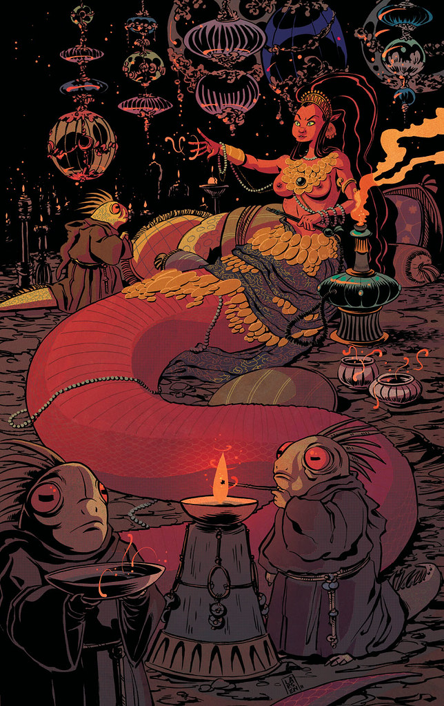
(click to enlarge)
I would like to quickly note that I make all my own textures...They are either my own photographs of cement or rusted metal or decaying buildings, or they are scans of paper that I systematically abuse. I highly suggest building a texture library of your own construction, and not ripping stuff off of texture websites.
EDIT: A final revision, where I fixed a few things that were staring me in the face, softened some of the shadows and added a little more texture and colored line... putting this file to bed, now.

Enjoyed this. Thanks for posting.
ReplyDeleteImage looks really good.
Was also interested in yer' post on using black & red inks. Clever stuff.
I'll use two colours - just coz it looks good - but had never thought about pre-empting the colour select process. Hmmmmm.
I think the two ink image looks great - even before the colouring and texturing!
You ever see Dave Cooper's ink drawings with two colour? - although I think he used a projector to beam them on to a surface to paint.
Wow, I really love the revisions you made on this piece. I especially love that you brought out the detailing in her scales just a bit more. Fantastic!
ReplyDeleteThx guys.
ReplyDelete